繋書体
- Typeface
- Motion
- Web
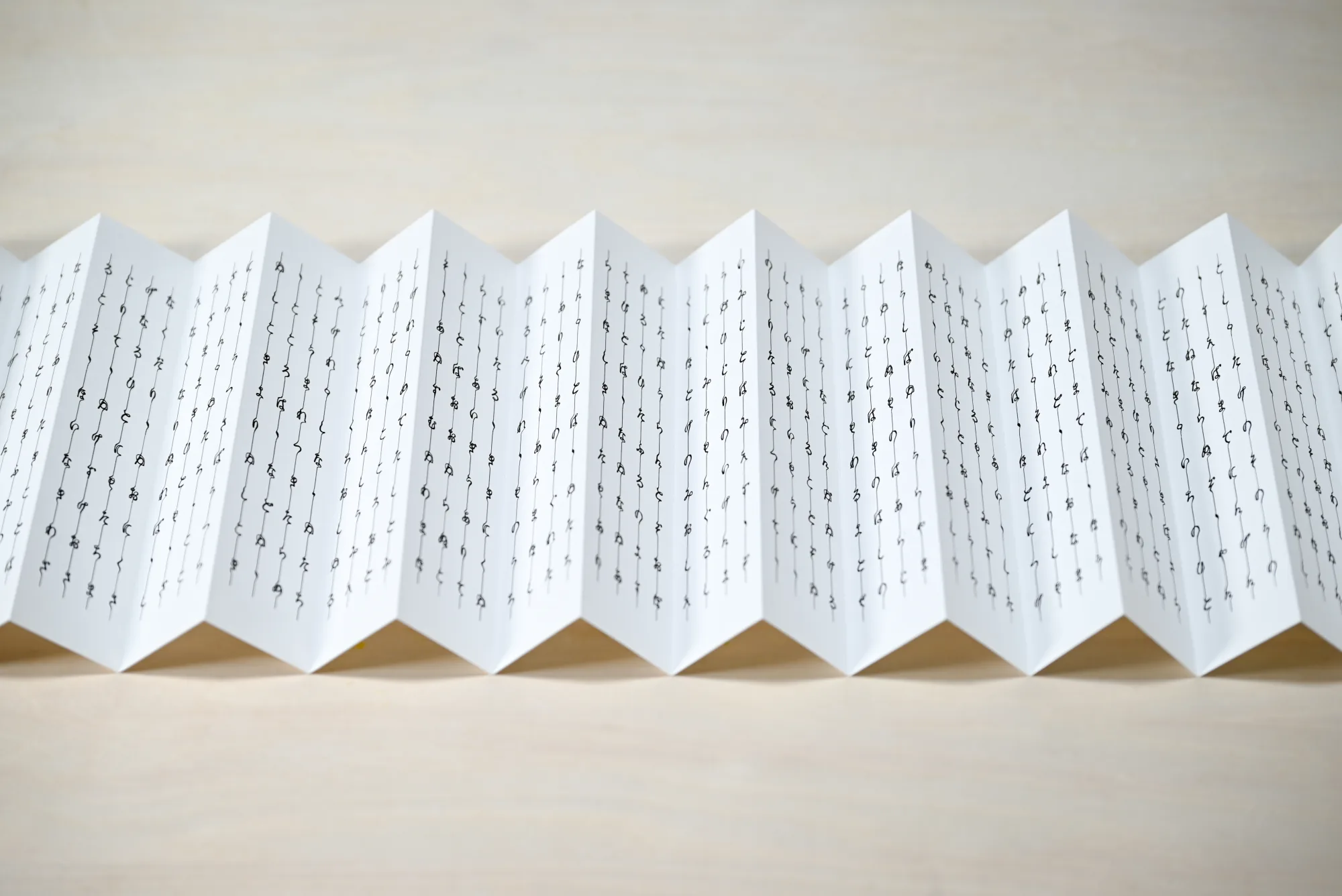
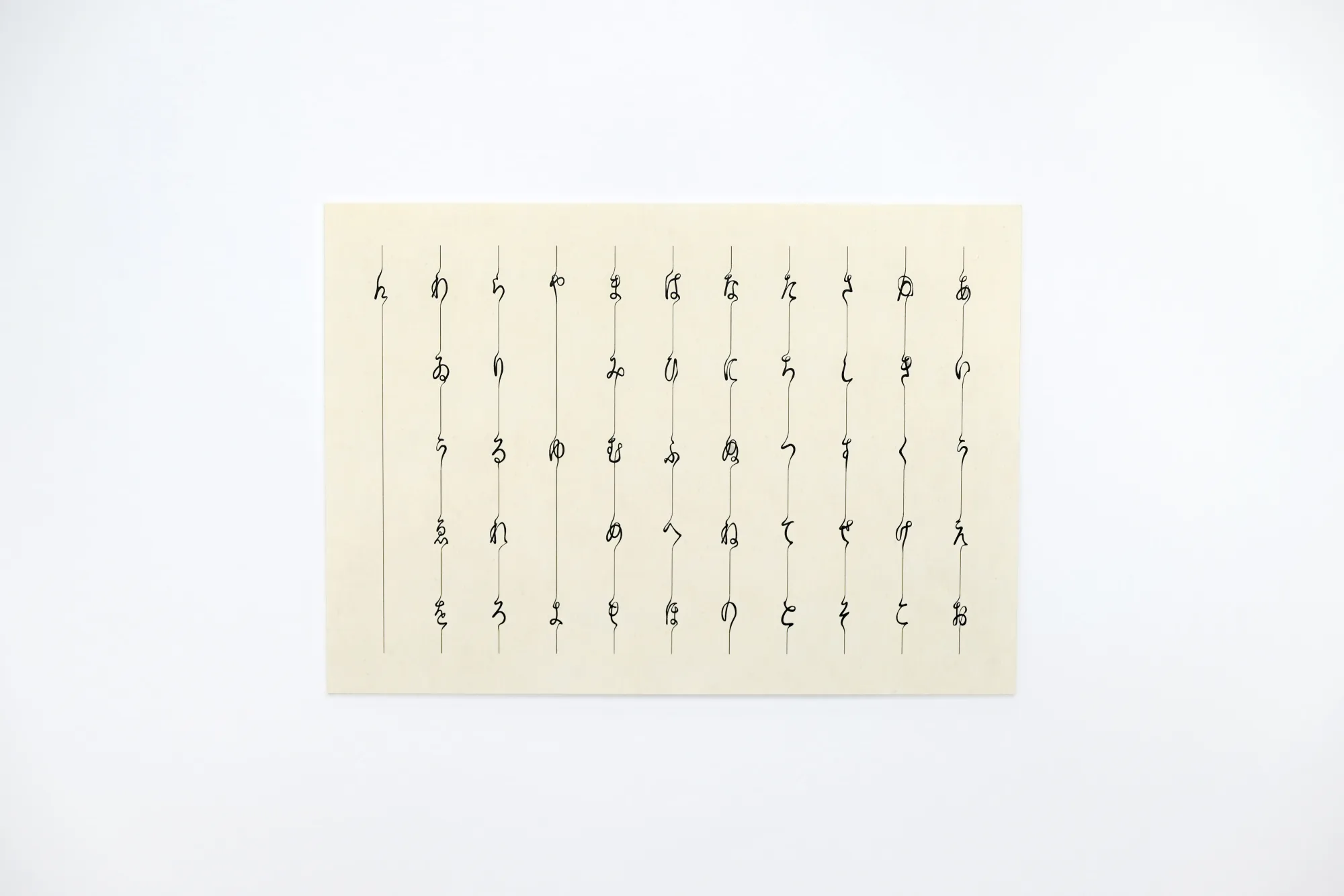
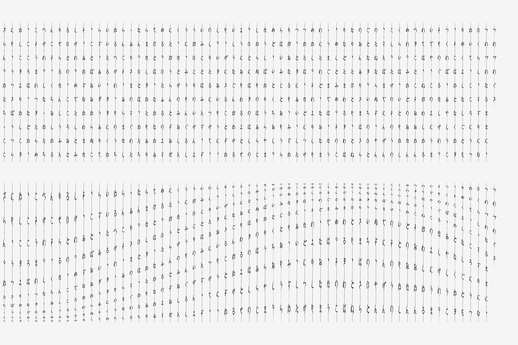
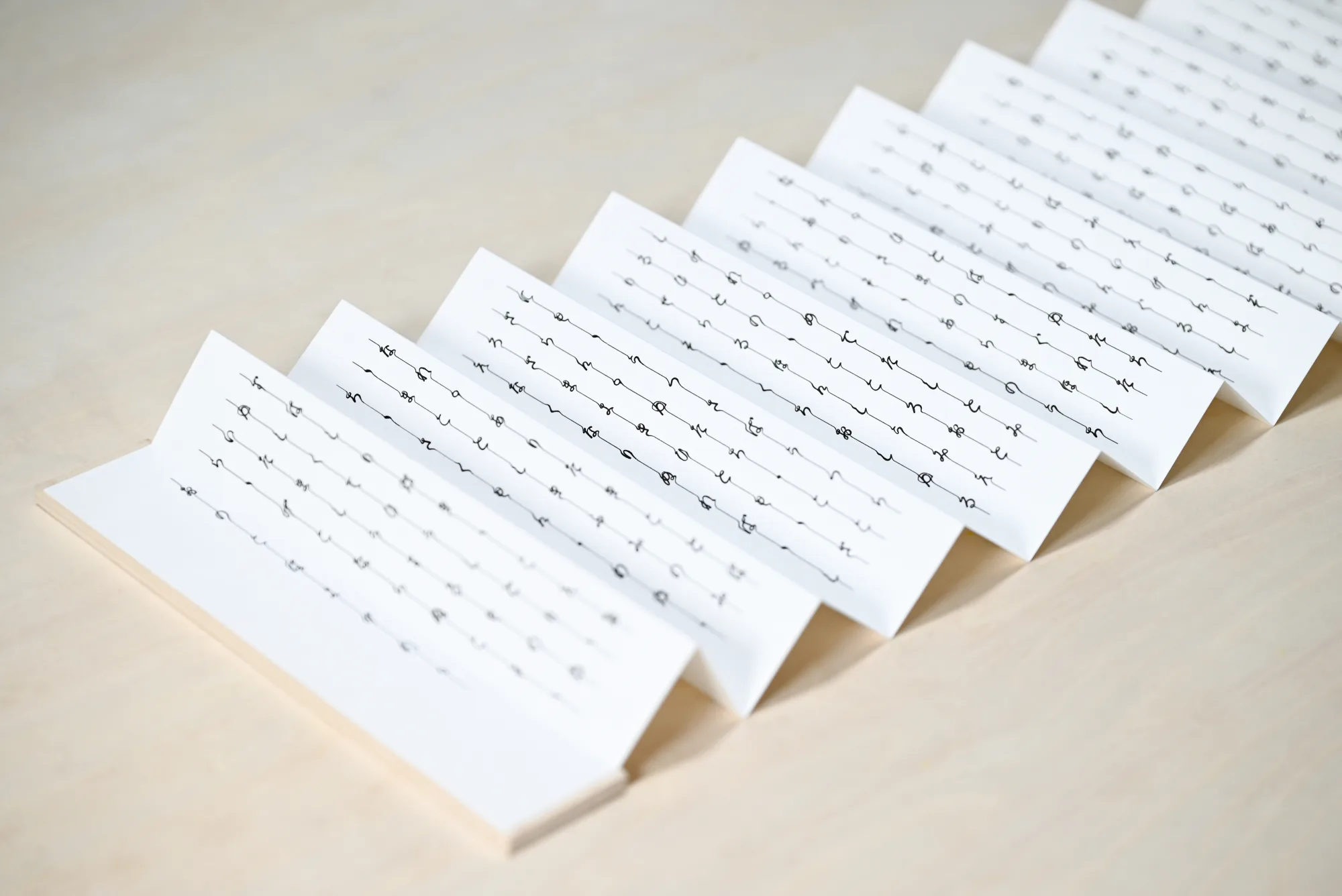
繋書体は、上から下へ流れるように書かれるひらがなの特性に着目した、縦書き専用の和文フォントです。文字の書き始めと書き終わりの位置を揃えることで、本来は独立している文字が連続し、一本の線として繋がります。
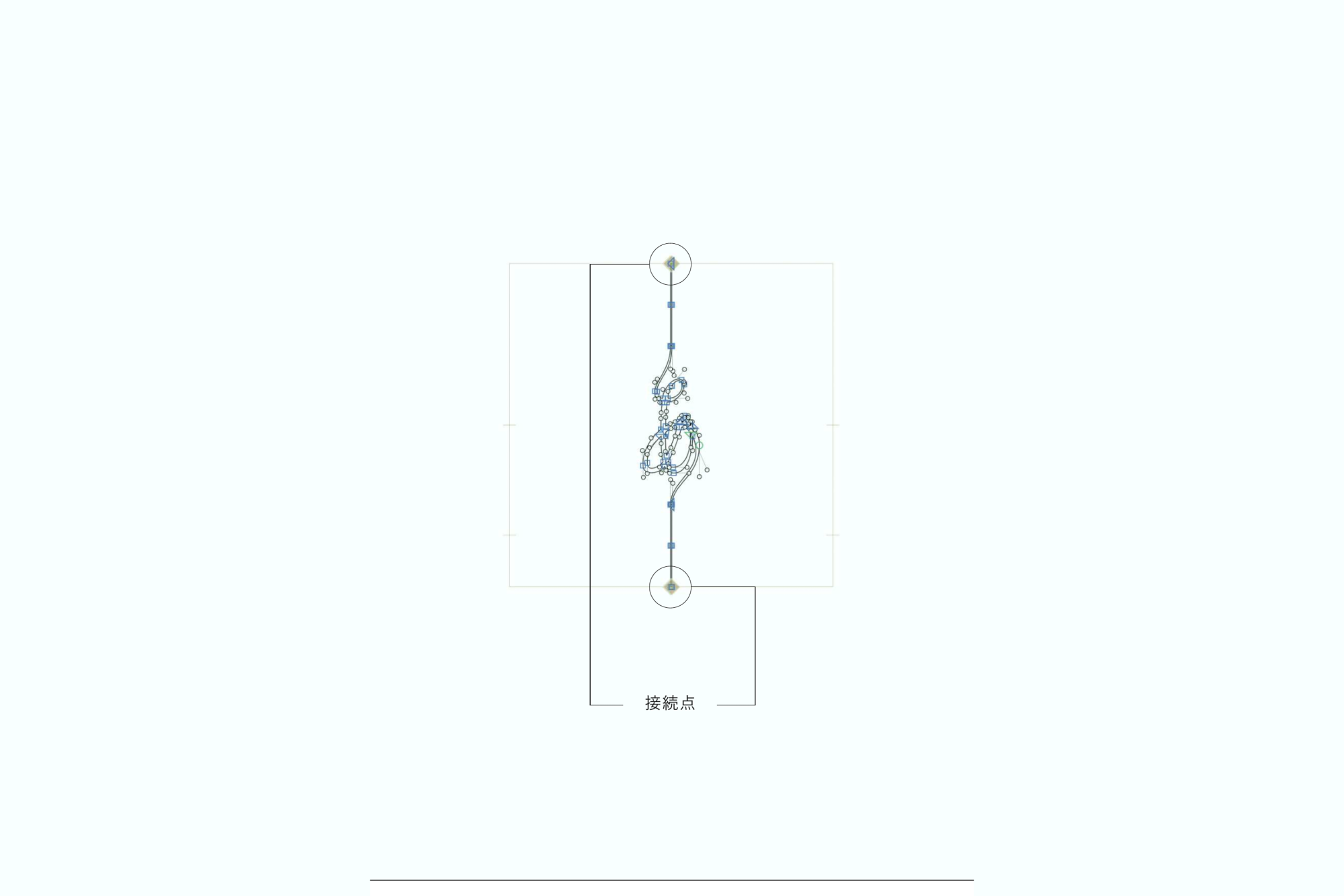
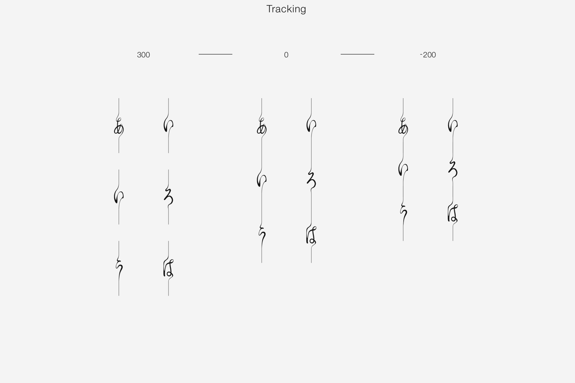
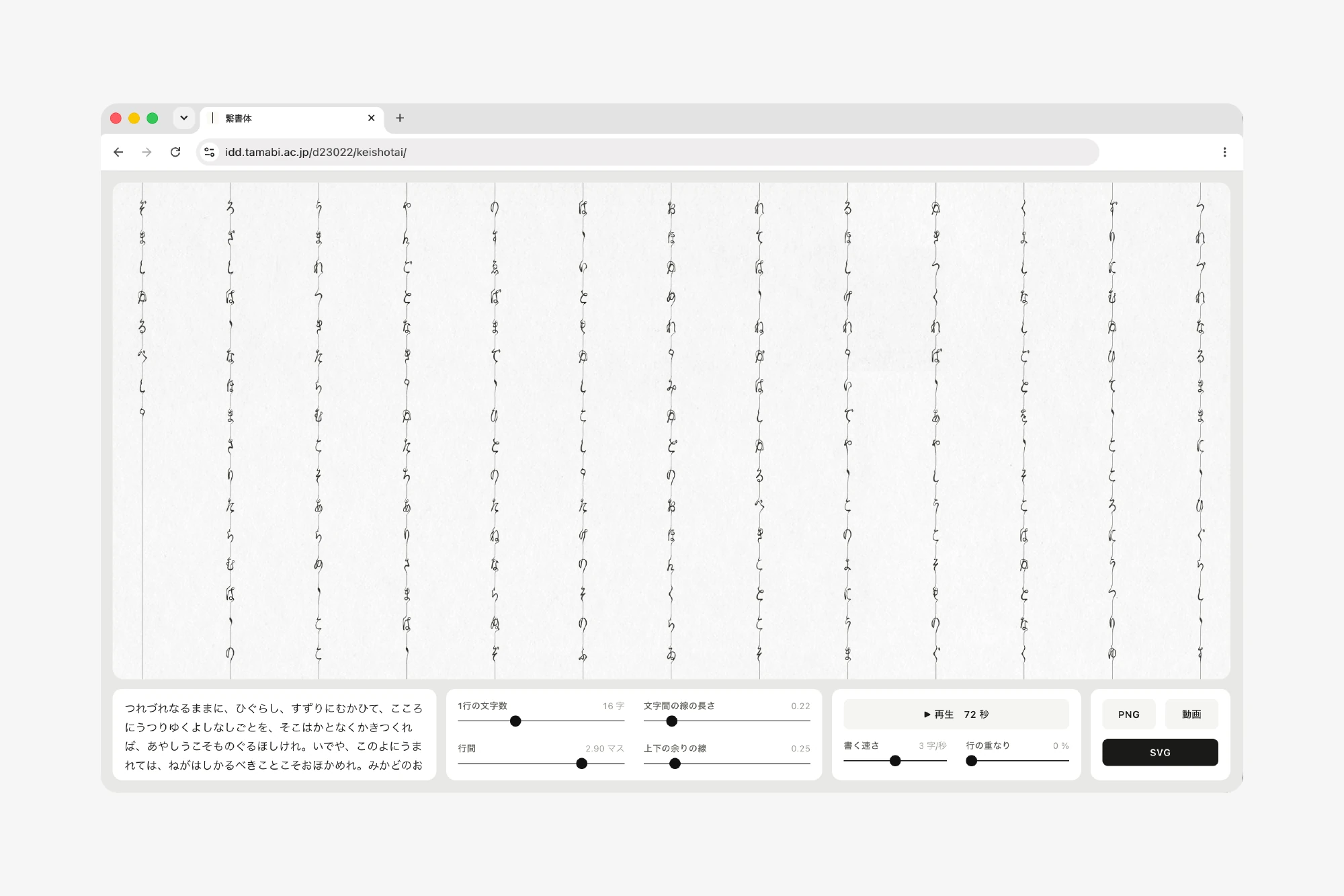
文字同士が連続して接続できる構造を、フォント制作ソフトのGlyphsで設計しました。文字間を調整すると繋がり具合が変わり、連続する流れとして捉えると、紋様としての展開も可能になります。打ち込んだ文章をそのままPNGやSVGで書き出せる、繋書体専用のウェブツールもつくりました。
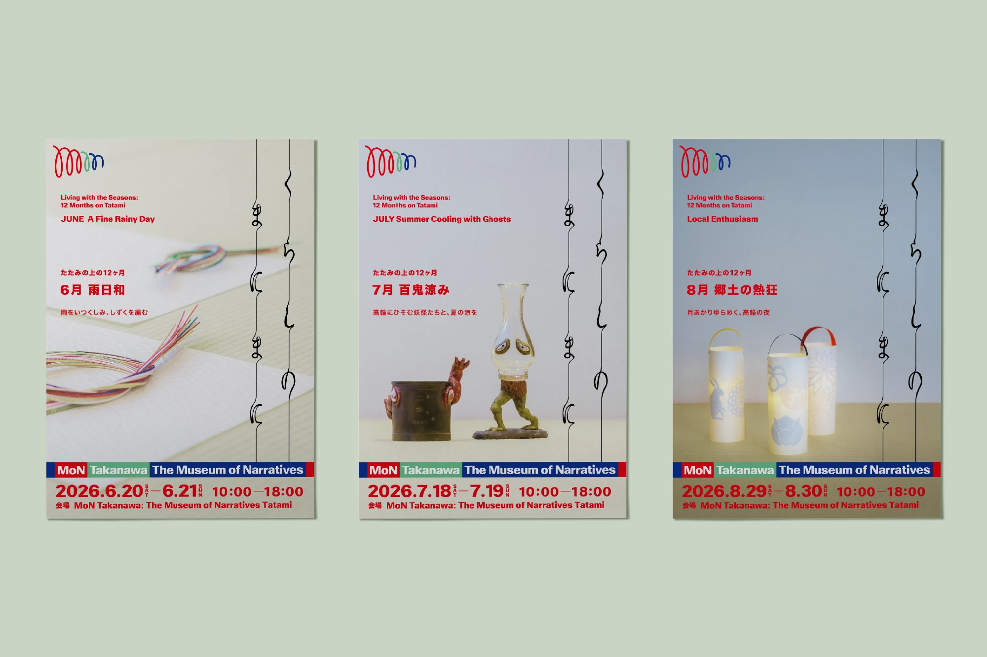
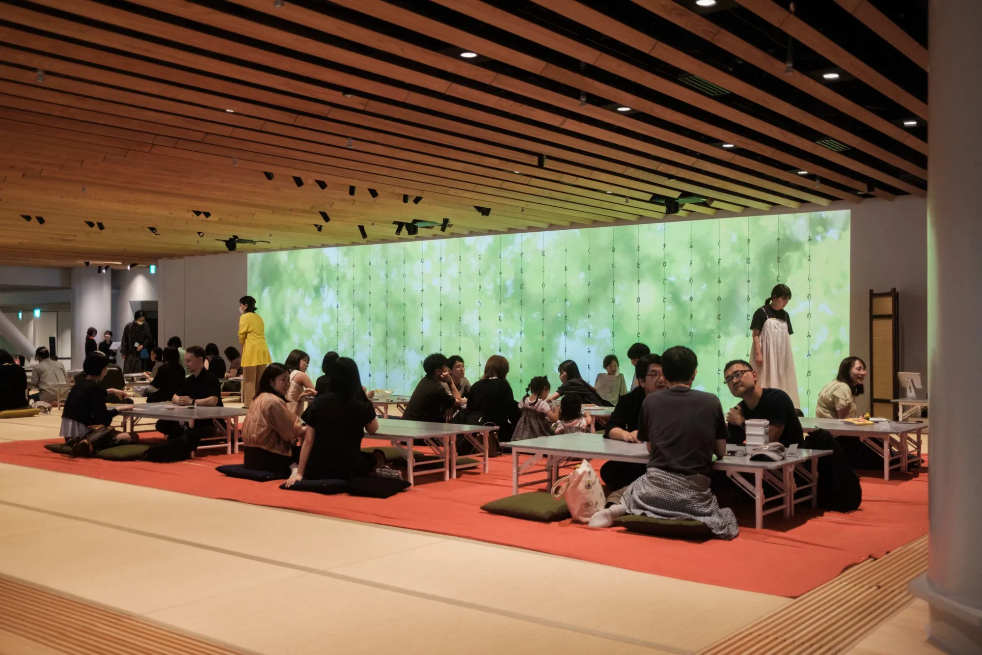
制作から2年後、MoN Takanawa: The Museum of Narrativesで月に一度ひらかれるプログラム「くらしのまにまに」のロゴに採用されました。2026年6月からは、モチーフ素材の撮影からキービジュアルのデザインまでを担当しています。イベントに合わせて制作したモーションは、4階にある約100畳の畳の間「Tatami」の壁一面に投影され、背景に使う実写映像も、その月のテーマに合わせて撮影しています。
Keishotai is a Japanese typeface designed exclusively for vertical setting, drawing on the way hiragana flows from top to bottom. By aligning where each letter begins and ends, characters that are normally independent join into a single continuous line.
The structure that lets adjacent characters connect was designed in the font editor Glyphs. Adjusting the tracking changes how tightly they join, and read as a continuous flow, a text can also unfold into an ornamental pattern. A dedicated web tool exports any typed text directly as PNG or SVG.
Two years after it was made, the typeface was adopted for the logo of Kurashi no Manimani, a monthly programme at MoN Takanawa: The Museum of Narratives. Since June 2026 I have been in charge of the key visuals, from shooting the motif materials to the final design. The motion pieces made for each event are projected across a wall of Tatami, a room of about a hundred tatami mats on the fourth floor, and the live-action footage behind them is also shot to match the theme of the month.
Details
2024年4月 – 5月
使用ツール:Glyphs / JavaScript / Python / After Effects
April – May 2024
Tools: Glyphs / JavaScript / Python / After Effects